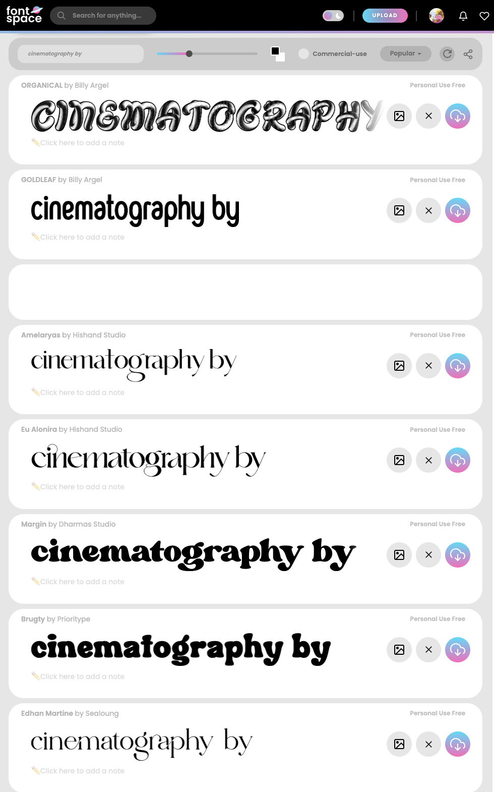
Once again just a wee update— I started to collect fonts for those credits in yesterday’s post. The actual names will be in my handwriting (written on the cups), but I’m still not sure what the title card (name of movie) and credits themselves should look like.
My analysis in that Credits Research post was pretty context-based (what’s happening around the credits, not the text itself), but maybe that’s kind of the point; to an extent, the typeface isn’t meant to be noticed. When it is, it can be a means of developing the film’s personality; I thought something artsy/visibly quirky (highly graphic, maybe vaguely retro) would fit both Audrey and Veda, whose dynamic define the tone of "Matcha."


No comments:
Post a Comment